As a designer, I believe branding is a very crucial piece to communicating your business and what you have to offer. My branding services include logo design, business cards, and any other graphics important to sharing your business. Any strong branding needs a clear visual language expressed through colors, typefaces and symbols.
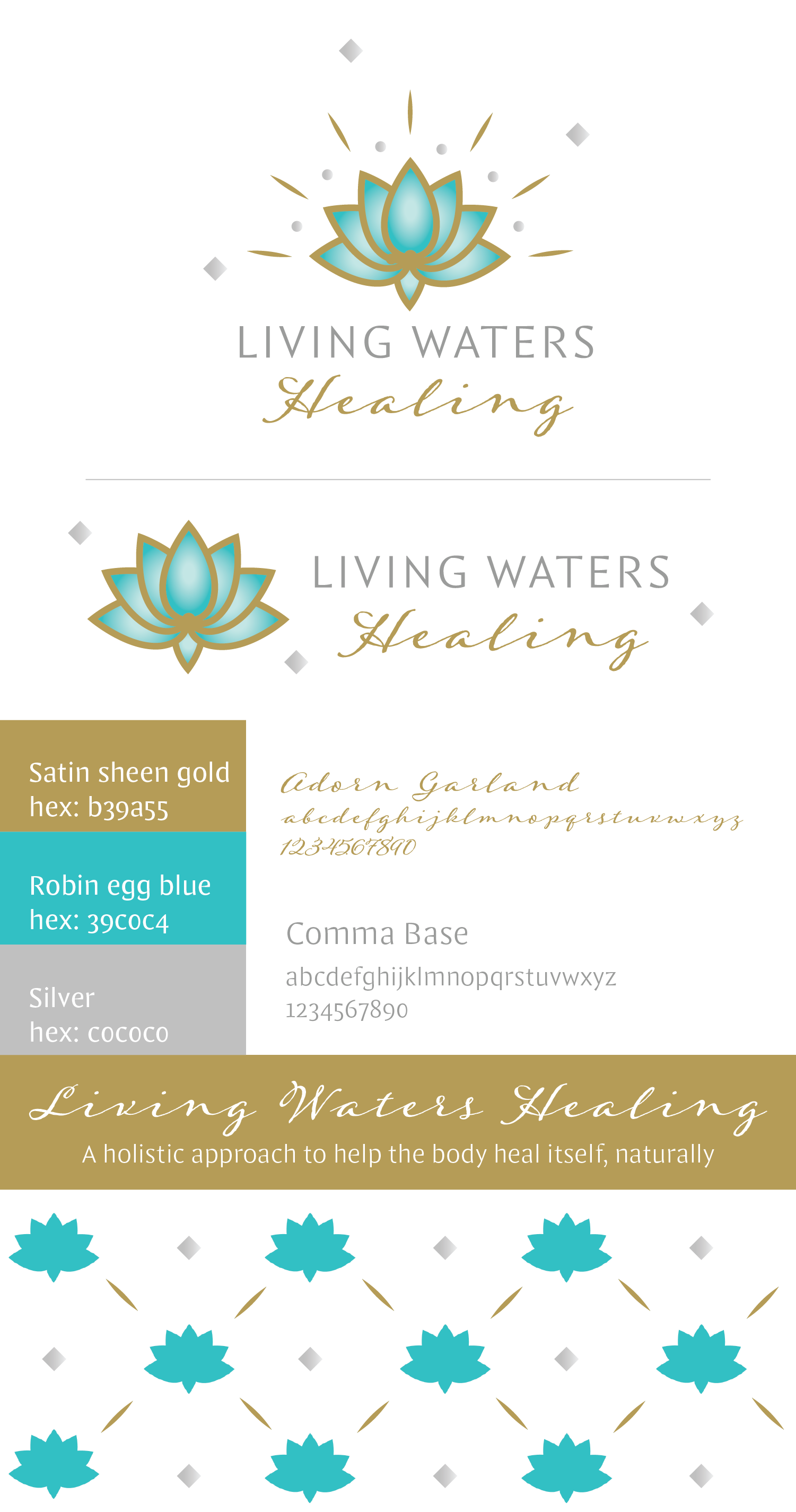

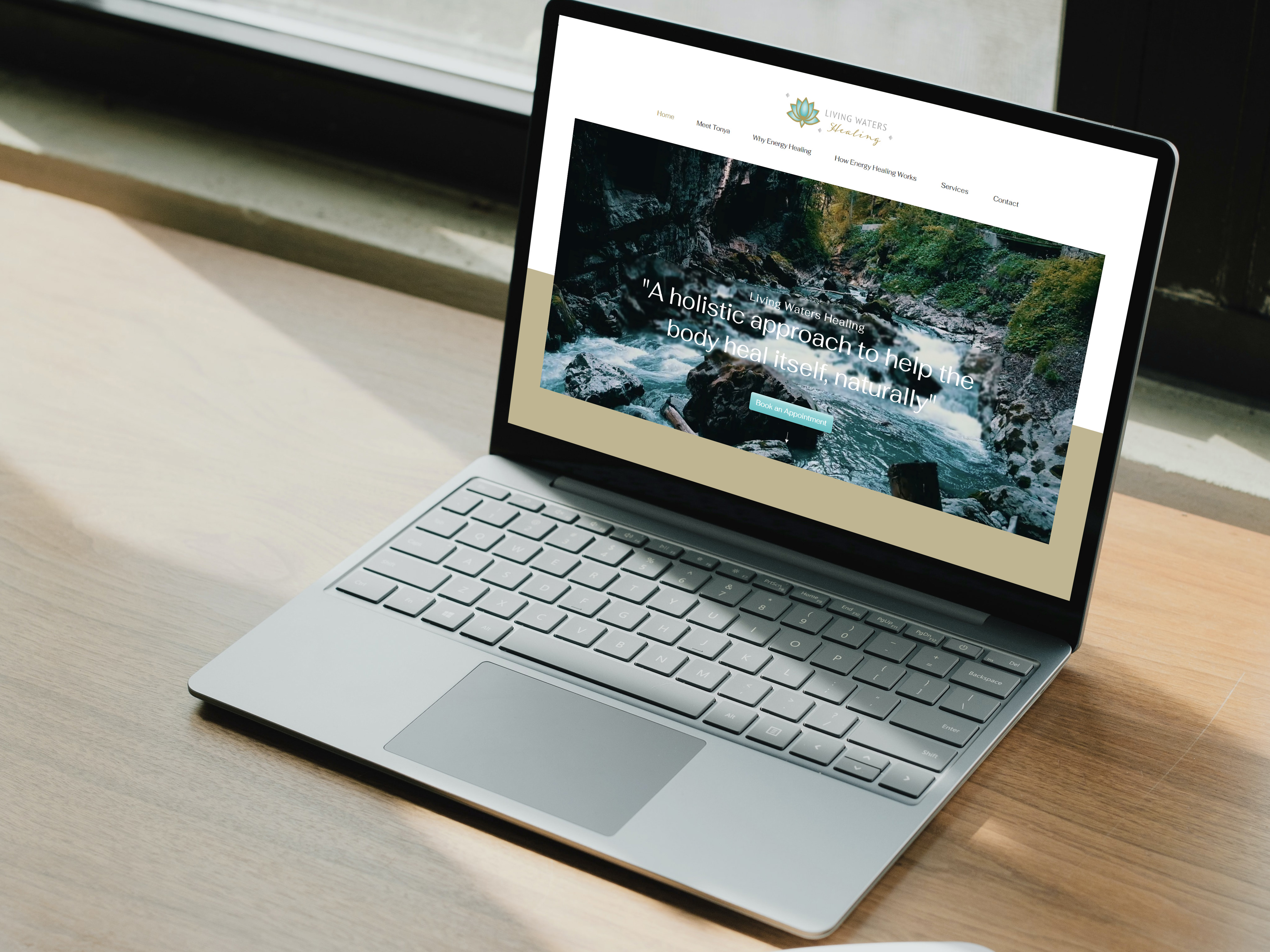
Wanting to expand her outreach work, my client asked me to create branding for her business in energy healing. The goal was to include imagery associated with energy healing and colors that invoke a calm feeling. With some research, I chose to incorporate a light blue lotus flower with gold and silver accents, bringing a calm and optimistic feel to the branding. Implementing two typefaces- one a clean sans serif and the other a script- creates contrast while still evoking a peaceful, energetic feel. With updated branding, my client was able to attract more clients with a clear, recognizable identity.
Fresh Drip Coffee
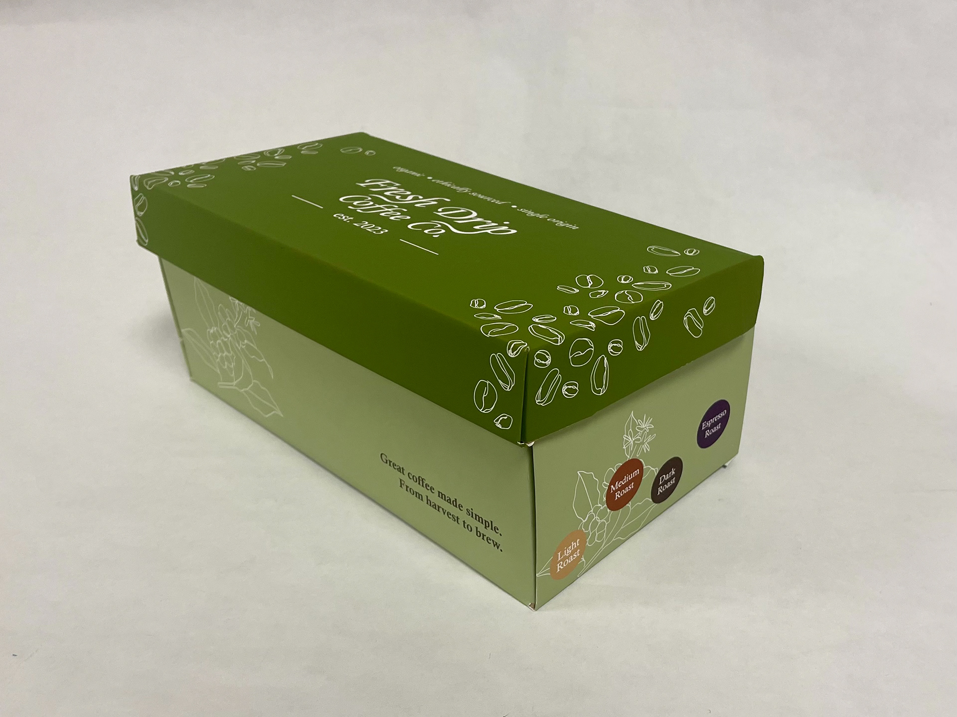
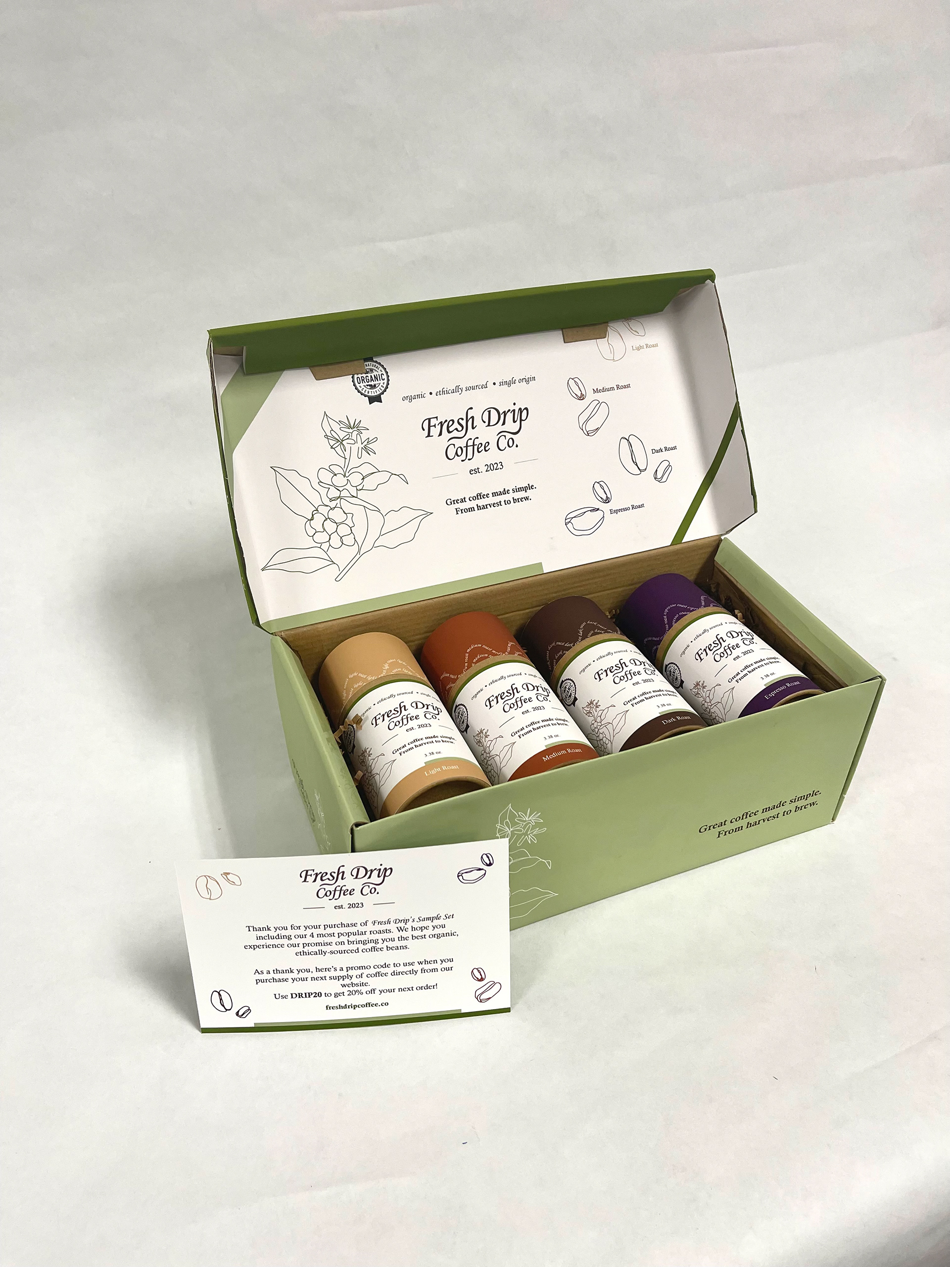
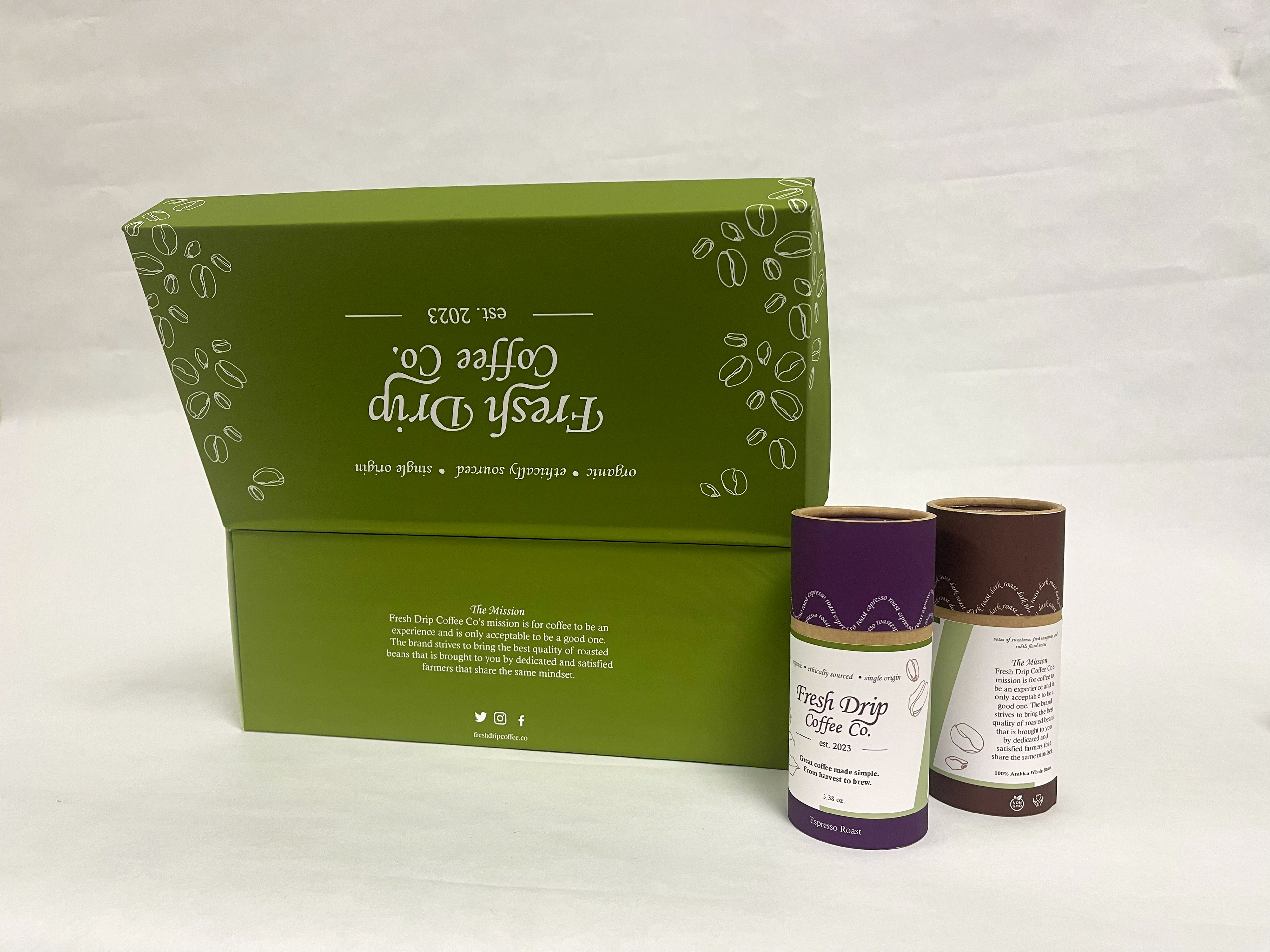
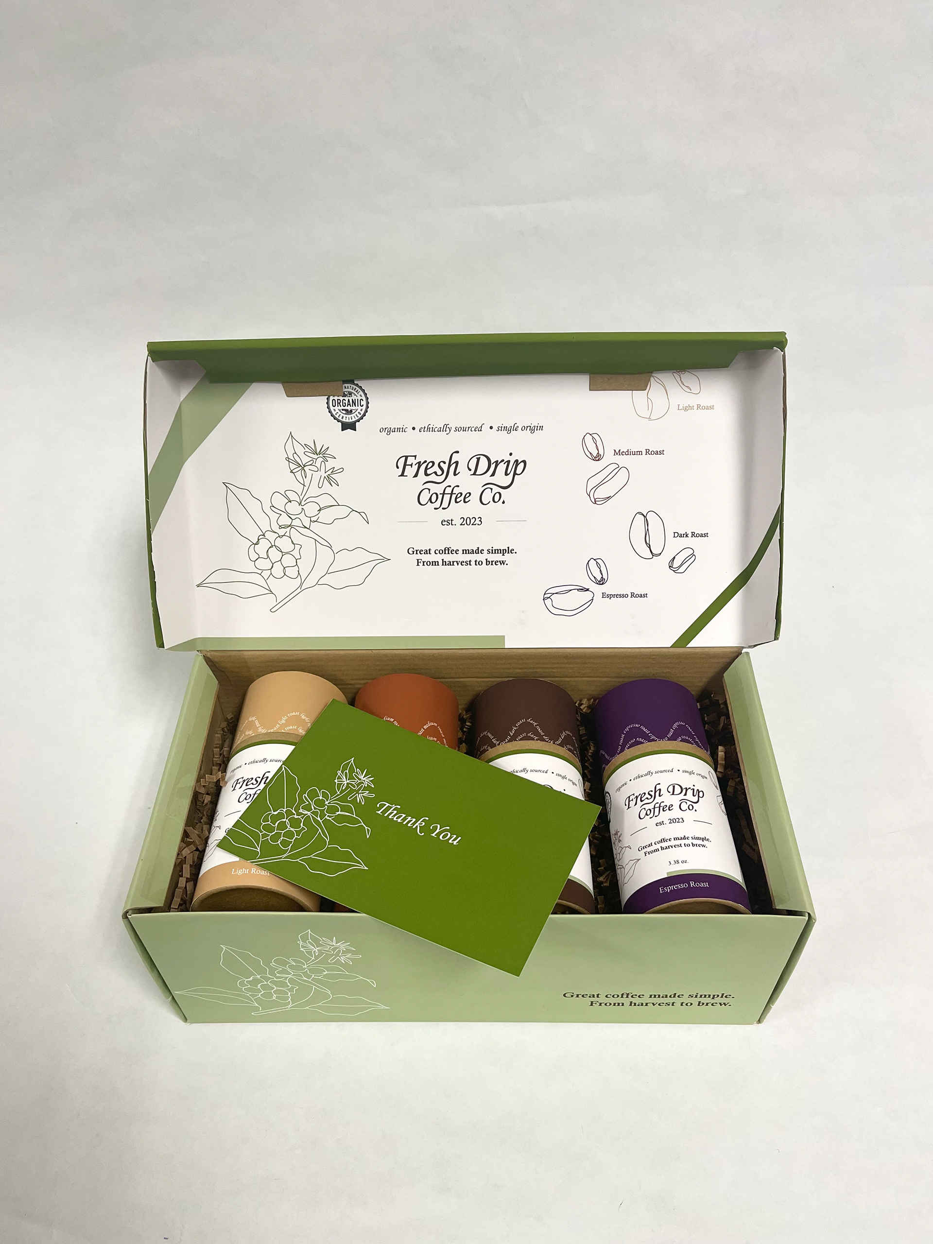
Fresh Drip is a coffee brand that sells organic single-origin coffee beans. Keeping a natural and simplistic aesthetic keeps the packaging oriented with its brand voice. The brand’s logo was designed to be simple and elegant. The name “Fresh Drip” implies an organic approach while using terminology that can be recognized in correlation to coffee. Fresh Drip uses recyclable packaging that can also be reused for different purposes. The color palette was kept to green and brown to emphasize the organic and naturalistic approach to coffee. The roast colors were decided so that a contrast could be represented. Serif typefaces for the packaging add a sense of class, appealing to its higher-end target audience.
Personal Branding
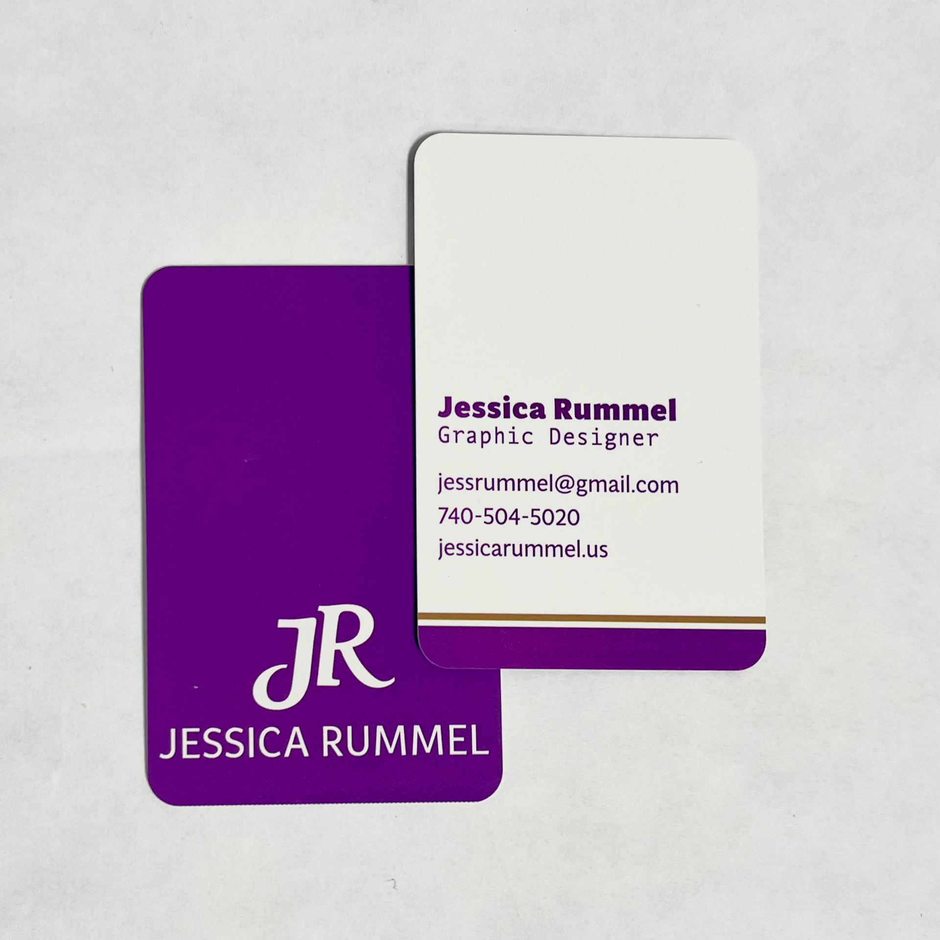
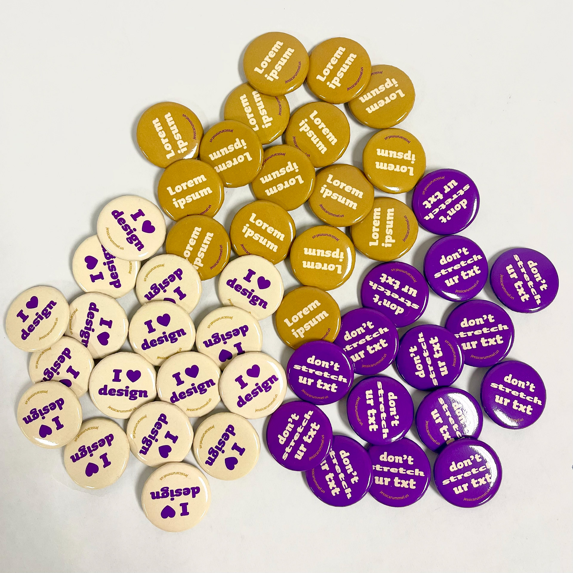
Purple was chosen for the Jessica Rummel brand because it matches the quiet yet bold aspect of the brand’s voice. Bringing a balance of coolness to the plum’s warm nature, pale yellow is able to match the quiet aspect of the brand. Dark gold was chosen as an accent color because it complements the purple without calling for
more attention. The brand’s logo has a simple yet intelligent structure. To match the voice of the brand the logo remained clean and simple, but with a touch of elegance captured by the matching tail and leg of the J and R. MultiDisplay is a sans-serif typeface chosen for the brand because it is able to read and has a variety of bold and light versions.
more attention. The brand’s logo has a simple yet intelligent structure. To match the voice of the brand the logo remained clean and simple, but with a touch of elegance captured by the matching tail and leg of the J and R. MultiDisplay is a sans-serif typeface chosen for the brand because it is able to read and has a variety of bold and light versions.